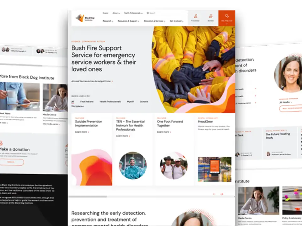
How I turned a slow, cluttered service website into a fast, conversion-focused experience—with measurable results in weeks.
The challenge
A mid-sized local services brand came to me with a common issue: traffic was steady, but leads were flat. Pages were slow, design was dated, and the contact flow was confusing. Marketing needed an editor-friendly site they could iterate on without breaking layouts.
Goals we set together
-
Clarify messaging and services
-
Improve mobile speed and Core Web Vitals
-
Reduce friction to contact/booking
-
Make content edits safe and simple for non-technical staff
My approach
1) Audit & strategy
I mapped the funnel (homepage → service pages → contact) and ran a performance/SEO audit to identify layout shifts, render-blocking assets, and thin content.
2) UX & content structure
Wireframes prioritized trust signals (reviews, badges, guarantees), clearer pricing cues, and persistent CTAs. I simplified navigation and added “call now” + “book” CTAs above the fold on mobile.
3) Build the right way in WordPress
-
Lightweight, accessible theme with custom blocks for hero, FAQs, pricing, and testimonials
-
Conditional loading (only load scripts/styles where needed)
-
Editor-friendly blocks so the team can build new pages without design drift


